Thursday, October 28, 2010

New Blog Banner


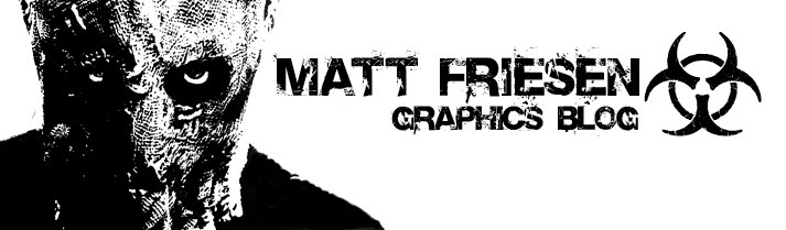
This wasn't an assignment, but I thought that my blog was due for a re-imagining. I looked through the new layouts for the blogs and found a black and white one. It's white with what looks like black paint splatters. The banner I had didn't go with that layout so I made a new one. I used a photo of me in my Halloween costume from last year (The Scarecrow from Batman Begins) and used a Gradient Map on it but made a quick transition between black and white. Then I just used the same font from before and added "Graphics Blog" below my name as well as a Bio-hazard symbol because it looks great and goes well with the look of my banner.

Wednesday, October 27, 2010

KEC Grad Wear


This was just a smaller assignment to design the new sweaters that the Graduates from KEC get after grad. Our school mascots are the Reivers, which were these raiders who lived around the border of England and Scotland. So I wanted to go with the sort of Warrior theme. I made a sword and an axe crossing around the text: "KEC 2011".

Type into a Scene

This assignment was to make 3 images where text looks as if it is a 3D object in a photograph using Photoshop.

For the First one, I just found a photo of some mountains in New Zealand and the text that I made to look like it was floating above some of the mountains said: "New Zealand" of course. The way I made it look 3D was using alot of Layer Blending Options. Gradient Overlay, and Inner Glow were the ones I used the most.

The Second image I did was a photo of Football players at the line of scrimmage and just put very big in between the two teams: "Football". I used the same Blending Options as before.


The Thirds image was the name of a band in a photo of that band. I made the text: "Thousand Foot Krutch" on the ground around the band's feet. I used the same I deas as the previous two images to make the text look just as 3D.

Audio to Visual


This assignment was different than most of the other assignments that we get. We had listened to a song and jot things down on what we visualized when hearing the song. Then we had to make a picture based on what we wrote down. We didn't know at first, but the song was from the soundtrack of the movie Moon. I visualized someone scared walking in the forest with scary silhouettes following them and eventually chasing them when the music's tempo picked up. I found some silhouettes of Zombies and put them into a creepy photo of a dark and gloomy forest. Then I thought of the idea to put that image and make it a reflection in someone's eye. So that's what I did. I used a grungy texture and overlayed it on the picture to top off the creepy theme of the picture.

Special Event Posters

This assignment was to design posters for 3 different Special Events happeningin Winnipeg. I chose The Central Canada Comic Con, The Teddy Bear's Picnic, and Safeway's Boo at the Zoo.

The Comic Con poster I did first. The major guest this year was Ray Park who played Darth Maul in Star Wars Episode 1: The Phantom Menace, and it's a Comic convention, so I put the two together and found a picture of Darth Maul from a Star Wars comic. Then I just tried to fit that image in with the rest of the text info. I used a comic looking font (don't worry, not Comic Sans MS) to keep with that theme. Darth Maul is Black and Red so I used that color scheme for the entire poster.

The Teddy Bear's Picnic is obviously geared towards kids so I made it fun looking with lots of colors and big lettering. It took a while to find a good picture of a Teddy Bear for the poster but I managed to get one that worked.

Safeway's Boo at the Zoo is also geared towards kids but it's also supposed to be somewhat scary. So I used the Halloween theme for the poster. Black and Orange is the general color scheme for Halloween. I used the silhouette of a zombie to occupy the empty space because there wasn't a lot of information.

KEC Info Handbook


This is the First assignment that we were given for Grade 12 Graphic Design. We were to design a new cover for the Kildonan-East Information Handbook. I went with a vectored look that I started in photoshop, then I re-vectored everything over in Illustrator. Our school is very proud of our football team and other sports teams so I thought I would theme it accordingly. We had to include that horrible KEC logo in it so I managed to fit it in nicely on both the front and the back covers. Then I added all the text in InDesign.