
Tuesday, January 25, 2011
Friday, January 14, 2011
Mini Docu-Movie
"Sorry I'm Awesome"
This assignment was to plan and film a short short film. The major part of the assignment was planning out the camera angles with storyboards. I decided to make a silly movie where I start marching to an incredibly catchy song called "Chelsea Dagger" by The Fratellis.
This assignment was to plan and film a short short film. The major part of the assignment was planning out the camera angles with storyboards. I decided to make a silly movie where I start marching to an incredibly catchy song called "Chelsea Dagger" by The Fratellis.
Rotoscoping Animation
This assignment was to create an animation in Flash by drawing over a real video.
I filmed myself strumming a guitar for a few seconds and then uploaded it to the computers, imported it into Flash, then started to draw over it. Every two frames I drew what the video looked like. I got to a certain point and I managed to loop the animation of stumming to seamlessly look like it was consistently strumming.
12th Annual KEC Show & Shine 2011

This assignment was to design a poster for this years Show & Shine at our school. Every year, people bring their cars to show them off and potentially win prizes.
I did the same assignment for the Show & Shine last year so I tried to differentiate this year's design from the last one I did. I found a photo of a Lamborghini and based the rest of the poster off of the color of the car. The look of the Typography that I went for was kind of a The Fast and the Furious kind of feel even though the font I used was from Blade Runner. I tried some cool effects on the photo of the car to make it more than just a regular photo. The amount of text and info that there was is absurd. It was difficult trying to fit it all in right.
Yes, I am aware that I spelled "Refreshments" wrong... I just didn't feel like fixing it...
Monday, November 29, 2010
Green Team Logos
 This wasn't exactly an assignment, but Mrs. Buchanan asked me to design a new logo for the KEC Green Team. I thought of just making it simple and sleek so I just made the text, "Green Team" and "Kildonan East Collegiate" in very simple fonts. Then I made another variant with a slightly more cartoonish, silly font. I couldn't decide which one I liked better so I made mock-ups of each logo on real pictures of shirts.
Package Design
This assignment was to design the packaging for a product of our choosing. I chose to do a Cereal box, as did many others in the class. At first I was making a kid's cereal called "Marsh Mall-O's" But I didn't like the way it was turning out so I started over. Then I thought of making a cereal that's sounds super boring and lame. The complete opposite of Marsh Mall-O's. I went with "Flax Flakes".
 I made the template myself, I just kind of eyeballed it. Wasn't sure if I had accurate dimensions. I started by making the logo of Flax Flakes look more simple and sophisticated rather than big, bold, and silly. Then I vectored the cereal bowl and the spoon. We were supposed to make 3 variations of the design. So I made the first one: "Flax Flakes Original".
 The second one I made: "Flax Flakes Field Berries" and changed the background to a deep purplish-pink and added berries to the cereal bowl.
 Then for the last one I made was: "Flax Flakes Chocolate", I changed the background to a light brown and added chocolate pieces to the cereal bowl.
Monday, November 1, 2010
"Yes I Can" Shirt Design

This logo design was supposed to be for kids so I made wanted to go for a fun look. I started by placing the “I” in the middle and then the “yes” and “can!” on either side of it. I moved each word the same angle. Then I made some shapes to occupy h empty space inbetween the words. At first they were just four sided shapes, then I used the Twirl Tool on both of those shapes at the same time so it would look like a swirl in the background. Then I added a 20 point stroke to the text, then copy and pasted the text, placed it over top the other text and got rid of the stroke. Now the text stands out from the swirls.
Thursday, October 28, 2010
New Blog Banner

This wasn't an assignment, but I thought that my blog was due for a re-imagining. I looked through the new layouts for the blogs and found a black and white one. It's white with what looks like black paint splatters. The banner I had didn't go with that layout so I made a new one. I used a photo of me in my Halloween costume from last year (The Scarecrow from Batman Begins) and used a Gradient Map on it but made a quick transition between black and white. Then I just used the same font from before and added "Graphics Blog" below my name as well as a Bio-hazard symbol because it looks great and goes well with the look of my banner.
Wednesday, October 27, 2010
KEC Grad Wear

This was just a smaller assignment to design the new sweaters that the Graduates from KEC get after grad. Our school mascots are the Reivers, which were these raiders who lived around the border of England and Scotland. So I wanted to go with the sort of Warrior theme. I made a sword and an axe crossing around the text: "KEC 2011".
Type into a Scene
This assignment was to make 3 images where text looks as if it is a 3D object in a photograph using Photoshop.
 For the First one, I just found a photo of some mountains in New Zealand and the text that I made to look like it was floating above some of the mountains said: "New Zealand" of course. The way I made it look 3D was using alot of Layer Blending Options. Gradient Overlay, and Inner Glow were the ones I used the most.
 The Second image I did was a photo of Football players at the line of scrimmage and just put very big in between the two teams: "Football". I used the same Blending Options as before.

The Thirds image was the name of a band in a photo of that band. I made the text: "Thousand Foot Krutch" on the ground around the band's feet. I used the same I deas as the previous two images to make the text look just as 3D.
 For the First one, I just found a photo of some mountains in New Zealand and the text that I made to look like it was floating above some of the mountains said: "New Zealand" of course. The way I made it look 3D was using alot of Layer Blending Options. Gradient Overlay, and Inner Glow were the ones I used the most.
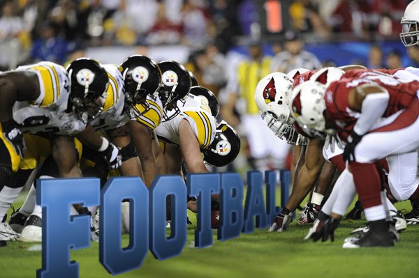 The Second image I did was a photo of Football players at the line of scrimmage and just put very big in between the two teams: "Football". I used the same Blending Options as before.
The Thirds image was the name of a band in a photo of that band. I made the text: "Thousand Foot Krutch" on the ground around the band's feet. I used the same I deas as the previous two images to make the text look just as 3D.
Subscribe to:
Comments (Atom)