Friday, February 26, 2010

Career Bridge Logo

This assignment was to design a new logo for the Career Bridge at our school. This was mostly an assignment focusing on typography. We needed to make 2 different logos. One is colored close to the school color and the other is yellow and purple.

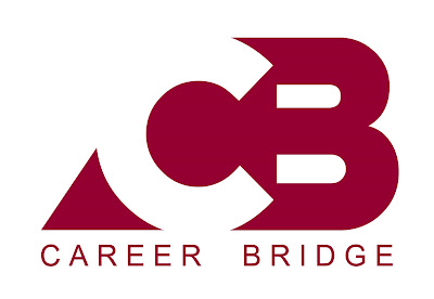
The first logo I made used the font called 'Crazy Loop in Paris' from dafont.com. I made the 'C' white and the 'B' burgundy. Then I made a shape behind the letters which was the same color as the 'B' so the 'C' would show up. Then I made the words 'Career Bridge' underneath the logo in the font called 'Arial'. I aligned the text to the logo by putting extra spaces inbetween the letters.


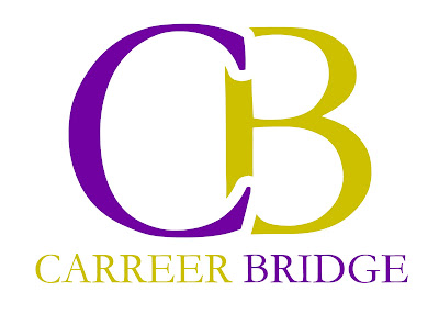
The second logo used the font called 'Garamond'. I made the 'C' purple and the 'B' yellow. I put a white 51 point stroke on the C and moved it so it overlapped the 'B' so there was negative space around the 'C'. Then I spelled out 'Career Bridge' underneath the Logo and made the word 'Career' yellow and the word 'Bridge' purple.


Thursday, February 25, 2010

School Play Poster


The latest assignment was to design the poster for the school play. It's called Suds and it's about the staff of a Car Wash. I found a Picture of a Volkswagen Beetle and put it into a 11x17 document in photoshop with a blue background. I went to Image - Adjustments - Gradient Map and made the gradient go from blue to whit with hardly any transition between the two colors. Then I found a picture of a hand print and overlayed the same blue as in the background. (A part in the play is when the characters are on a television show competition where they have to keep their hand on a car, if they take it off the lose and are out. The winner wins the car. Thus, the hand prints on the car) I duplicated the hand prints and warped each one to make them look slightly different from one another. Then I used a font I downloaded from dafont.com called '28 Days Later'. I spelled out the word 'SUDS', and I made an assortments of various circles to signify bubbles behind the title. I made the word 'SUDS' have a stroke of the same blue as the background so it had more contrast. I added the rest of the text to fit in the pictures. Then I made sevral variants of the poster each with a different color. Blue, Green, Red, Orange, and Purple.


Wednesday, February 10, 2010

CD Cover


This assignment was a CD cover. I made up a band called 'Crooked Soul' because I couldn't decide on a band to do a cover for. I found the picture of the eye here. Then I found the picture of the hurricane here. I cut out the eyeball part and inserted the hurricane into the hole that was left in the eye socket. I then took a picture of the grime for an effect from here. I erased parts of that picture so the eye could show through, then I went to Image - Adjustments - Hue and Saturation, and changed the hue to a more blue color. Then I took that layer and made it's layer mode 'Overlay'. Then I made a new layer and used the paint bucket to fill the whole canvas with a blue color and set that layer to 'Overlay' as well. I downloaded the fonts from dafont.com. The words 'Crooked Soul' are the font called 'Base 02', and the words 'Eye of the Storm' are the font called 'Defused'. Then I put the text all together. I gave the text an inner shadow and set all text layers to 'Overlay'. Then I added a slight white shape behind 'Crooked Soul' to make it a little more legible.

The band 'Crooked Soul' doesn't actually exist. It's just a band name I made up a while ago and so I thought i'd use it now. It originally comes from lyrics of a song by the band Switchfoot. "We are crooked souls trying to stay up straight." 'Eye of the Storm' just sounded cool so I used it as the Album title. There's blue because of the picture of the hurricane had mostly blue so I made it all fit together. I like the worn out look so I made it look old, grungey, and beat up. It's supposed to be like a metal CD so that's why it looks grimy and gritty. As you may be able to tell I like to use the layer mode 'Overlay'.


Tuesday, February 9, 2010

New Banner

My first assignment in Graphic Design 30s was to make the banner graphic for my blog. 

The whole idea was to play with layer modes on photoshop. I took this picture of myself, added a picture of fire to the background from Google Image Search, and played around with things. I generally experiment a lot when it comes to layer modes.

I love the way fire looks and the way it makes things look evil or hardcore, so i used it for the background. I also love grungey, messy text like the font I used. It doesn't signify me all that much, just the fact that I love those aspects of it.

Monday, February 8, 2010

Test Post

This blog will be me showcasing my graphic art. I will post my projects that I do in Grade 11 Graphic Design.

This picture was an assignment I did last semester. It is a movie poster. I made the ship in Cinema 4D, then I put it into photoshop and added the planets as well as the text.