Monday, November 29, 2010

Green Team Logos

This wasn't exactly an assignment, but Mrs. Buchanan asked me to design a new logo for the KEC Green Team. I thought of just making it simple and sleek so I just made the text, "Green Team" and "Kildonan East Collegiate" in very simple fonts. Then I made another variant with a slightly more cartoonish, silly font. I couldn't decide which one I liked better so I made mock-ups of each logo on real pictures of shirts.

Package Design

This assignment was to design the packaging for a product of our choosing. I chose to do a Cereal box, as did many others in the class. At first I was making a kid's cereal called "Marsh Mall-O's" But I didn't like the way it was turning out so I started over. Then I thought of making a cereal that's sounds super boring and lame. The complete opposite of Marsh Mall-O's. I went with "Flax Flakes".

I made the template myself, I just kind of eyeballed it. Wasn't sure if I had accurate dimensions. I started by making the logo of Flax Flakes look more simple and sophisticated rather than big, bold, and silly. Then I vectored the cereal bowl and the spoon. We were supposed to make 3 variations of the design. So I made the first one: "Flax Flakes Original".

The second one I made: "Flax Flakes Field Berries" and changed the background to a deep purplish-pink and added berries to the cereal bowl.

Then for the last one I made was: "Flax Flakes Chocolate", I changed the background to a light brown and added chocolate pieces to the cereal bowl.

Monday, November 1, 2010

"Yes I Can" Shirt Design


This logo design was supposed to be for kids so I made wanted to go for a fun look. I started by placing the “I” in the middle and then the “yes” and “can!” on either side of it. I moved each word the same angle. Then I made some shapes to occupy h empty space inbetween the words. At first they were just four sided shapes, then I used the Twirl Tool on both of those shapes at the same time so it would look like a swirl in the background. Then I added a 20 point stroke to the text, then copy and pasted the text, placed it over top the other text and got rid of the stroke. Now the text stands out from the swirls.

Thursday, October 28, 2010

New Blog Banner


This wasn't an assignment, but I thought that my blog was due for a re-imagining. I looked through the new layouts for the blogs and found a black and white one. It's white with what looks like black paint splatters. The banner I had didn't go with that layout so I made a new one. I used a photo of me in my Halloween costume from last year (The Scarecrow from Batman Begins) and used a Gradient Map on it but made a quick transition between black and white. Then I just used the same font from before and added "Graphics Blog" below my name as well as a Bio-hazard symbol because it looks great and goes well with the look of my banner.

Wednesday, October 27, 2010

KEC Grad Wear


This was just a smaller assignment to design the new sweaters that the Graduates from KEC get after grad. Our school mascots are the Reivers, which were these raiders who lived around the border of England and Scotland. So I wanted to go with the sort of Warrior theme. I made a sword and an axe crossing around the text: "KEC 2011".

Type into a Scene

This assignment was to make 3 images where text looks as if it is a 3D object in a photograph using Photoshop.

For the First one, I just found a photo of some mountains in New Zealand and the text that I made to look like it was floating above some of the mountains said: "New Zealand" of course. The way I made it look 3D was using alot of Layer Blending Options. Gradient Overlay, and Inner Glow were the ones I used the most.

The Second image I did was a photo of Football players at the line of scrimmage and just put very big in between the two teams: "Football". I used the same Blending Options as before.


The Thirds image was the name of a band in a photo of that band. I made the text: "Thousand Foot Krutch" on the ground around the band's feet. I used the same I deas as the previous two images to make the text look just as 3D.

Audio to Visual


This assignment was different than most of the other assignments that we get. We had listened to a song and jot things down on what we visualized when hearing the song. Then we had to make a picture based on what we wrote down. We didn't know at first, but the song was from the soundtrack of the movie Moon. I visualized someone scared walking in the forest with scary silhouettes following them and eventually chasing them when the music's tempo picked up. I found some silhouettes of Zombies and put them into a creepy photo of a dark and gloomy forest. Then I thought of the idea to put that image and make it a reflection in someone's eye. So that's what I did. I used a grungy texture and overlayed it on the picture to top off the creepy theme of the picture.

Special Event Posters

This assignment was to design posters for 3 different Special Events happeningin Winnipeg. I chose The Central Canada Comic Con, The Teddy Bear's Picnic, and Safeway's Boo at the Zoo.

The Comic Con poster I did first. The major guest this year was Ray Park who played Darth Maul in Star Wars Episode 1: The Phantom Menace, and it's a Comic convention, so I put the two together and found a picture of Darth Maul from a Star Wars comic. Then I just tried to fit that image in with the rest of the text info. I used a comic looking font (don't worry, not Comic Sans MS) to keep with that theme. Darth Maul is Black and Red so I used that color scheme for the entire poster.

The Teddy Bear's Picnic is obviously geared towards kids so I made it fun looking with lots of colors and big lettering. It took a while to find a good picture of a Teddy Bear for the poster but I managed to get one that worked.

Safeway's Boo at the Zoo is also geared towards kids but it's also supposed to be somewhat scary. So I used the Halloween theme for the poster. Black and Orange is the general color scheme for Halloween. I used the silhouette of a zombie to occupy the empty space because there wasn't a lot of information.

KEC Info Handbook


This is the First assignment that we were given for Grade 12 Graphic Design. We were to design a new cover for the Kildonan-East Information Handbook. I went with a vectored look that I started in photoshop, then I re-vectored everything over in Illustrator. Our school is very proud of our football team and other sports teams so I thought I would theme it accordingly. We had to include that horrible KEC logo in it so I managed to fit it in nicely on both the front and the back covers. Then I added all the text in InDesign.

Wednesday, June 9, 2010

Vinyl Decal


This assignment was to design a vinyl decal. It was just supposed to be a simple black and white vector. I vectored the logo of the metal band Demon Hunter that they use on each of their album covers in various innovative ways. I love the way this logo looks. It's a cool demonic looking head of some sort of creature. I just vectored the picture in Adobe Illustrator. I made it as simple as possible with as little lines that could be used.

Wednesday, June 2, 2010

Portfolio Cover


Since I am making a portfolio for all the graphics work I've done this year, I thought I'd post the cover that I made for said portfolio. I think it's probably my best work yet. I love the way it turned out. I put in and arranged the text to look as it does, then I made two shapes on the top and bottom of the page. One orange the other blue. Then I duplicated each one and moved the orange on up more and the blue duplicate down more and then overlayed them so they'd look darker. Then I brought in my own artwork. The picture was of a superhero character of mine, I originally didn't mean to make it look like me but everyone started saying it did, so I just used it here now that I agree on how much it does look like me. Except now I have shorter hair. Then I made the drawing layer a 'Pin Light' layer mode. Then at the top orange part of the page, I made some spiky shapes with the pen tool. Then I found a stock picture of a grimy cement wall from deviantART here. I made that layer a 'Color Burn' layer mode to finish off the cool effect I was going for.

Monday, May 31, 2010

Graphics Poster


This assignment was to make a poster for graphic design. We were supposed to get a quote about graphic design and incorporate it into the design of the poster. I went with the grungey and rugged look again because I think it looks really good. I found the quote by Alexander Isley: "Good design encourages a viewer to want to learn more." I 100% agree with this quote so I chose it and brought it into the poster. I played around a lot with colors, I was originally going to go with red black and white, but I've done that so many times before. Then I thought of making it purple instead of red, but purple doesn't fit as well with the gruney look I was going for. I eventually just settled on orange. The large rectangles were just blown up letters from the font 'Capture It'. As was the rest of the text.
To complete the look of grunge, I found a picture of bark from a tree and copied it into the file. Then I made the picture 'Multiply' and decreased the opacity to 55% so it would effect the picture perfectly.

Friday, May 7, 2010

Magazine Page Layout


This assignment was to design a layout for a magazine spread. We had to find an article and make it look like it's from a magazine by using InDesign. I, again, couldn't think of anything to look for. So I just went with Hockey again. The article was from Chicago's Daily Herald and was written by Tim Sassone. It was about the Blackhawks winning their series and moving on to play the Vancouver Canucks.
I took the article and pasted it into the pages. We learned how to make columns and how to properly make a layout for a magazine article. Then I Made up a title, and used the previous title as a deck (tag line). I brought in some pictures from the Chicago vs Nashville playoff games and moved the test around to fit said pictures. I made some rectangles for either above or below the pictures. The color scheme there was partly for the Blackhawks black and red but then I made the long rectangle for the bottom of the pages yellow to go with the red lines o look like the boards on the sides of a hockey rink. Then I put the Blackhawks logo in the background with a very low opacity of about 8%. The pull quote I made blue to stand out from everything else so that it caught the eye. I fought to get the text to fit perfectly so it could actually look good and professional. But in the end it turned out great, for my first magazine spread layout that is.

Thursday, April 29, 2010

Calendar


This assignment was a small personal calendar about a company, event or organization. It took me forever to finally choose what to do. I originally was going to do something about Drama but I honestly could not find a single thing of info on when the drama team practices. So I chose to do something else. I'm not a huge sports fan but I have been following the NHL Stanley Cup Playoffs lately. My favorite team right now is the Chicago Blackhawks so I chose to do a calendar with the schedule of the Blackhawk's games against the Nashville Predators. I found a couple pictures of the Blackhawks and put them on a picture in Photoshop. Then I placed the pictures together in an InDesign file. I put the text in with InDesign. The Calendar part was arranged with tabs. Then I put the yellow circles around the days that games were scheduled. The text at the top was colored the colors of the Blackhawks, Black and Red. Then I took all of the layers and put them in a certain template so I could print it out and fold it accordingly.

Thursday, April 15, 2010

Technical Illustration


This assignment was to vector a picture of something artificially manufactured. I chose to do a picture of the Millennium Falcon, Han Solo's ship from Star Wars. I wanted to challenge myself. I originally was going to do something much, much simpler, but then I saw what some other students were doing and I changed my mind. Instead of going with photo realism I decided to make the picture look like it was kind of cartoony. Solid colored shapes with outlines. It took quite a while to complete. I started with the cockpit, then went on to do the satellite, then I did the main body (which was the biggest layer of them all) and then I did the front two parts (whatever they're called).

Monday, March 22, 2010

Cure-A-Thon poster


This assignment was a poster for the Cure-A-Thon at my school. It's put on every year by the Hairstyling program.

The one used the previous year was hideous, so we were assigned to make a good one for this year. They wanted it to be simple. I took a photo of holding hands and vectored them so it was just silhouettes of arms. I made one arm black and one arm white for contrast. All the info was given so I pieced it all together the way I thought it looked good with most of the text black and then the title white so it would pop out more.

Friday, March 19, 2010

Vector Landscape


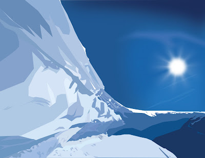
This assignment was to make a vector picture of a landscape. So we were supposed to use Adobe Illustrator. I originally started with a city landscape, but it didn't turn out like I planned so I chose a different picture. I chose an ice ridge to vector.

Most of the shapes that I made had only straight edges, no curves. Only the circle I used for the sun had curves. I made shapes for each change in color then I used the eyedropper tool to get the color from the picture into each individual shape. For the sky I put a Gaussian blur to make it look more like a real sky then for the rays of the sun, I used radial blur.

Wednesday, March 10, 2010

Drink Can

This assignment was to design a label for a Drink Can. I went with an energy drink. I came up with the name Ignite Energy because it sounds cool. I down loaded the font called 'Pulse sans virgin' from dafont.com.

The label design took a lot of playing around with to get quite right. I used Adobe Illustrator to design the label. I started with a green color and typed 'ignite' and 'energy' in separate text layers so I could make them different sizes and move them around easier than if it was in the same layer. Then I duplicated the logo and made the second set of words black and put them behind the green ones. I made the black letters have a slight stroke around them so the words on top of them were more legible. I put a white rectangle behind the word 'energy' for some extra design. I colored the background black because I like the combination of black and green. Then I found a picture of cartoony fire and made my own custom vector for it so the background could have a little flare to it. Then I added the rectangle at the top which has the slogan 'Ignite the feeling' in it, in the font '28 Days Later'. Then I added the flavor name at the bottom in the lighter part of the fire. I made the flavor Lime because I already had it green. Then I made two other variations of the design for two other flavors. Purple for Grape and Orange for, well... Orange.

Then I took the can picture that was provided for us. I brought the label design into photoshop after warping it in Illustrator to make it fit a 3D can better. In Photoshop I took the label design and set it's layer mode to overlay and fit it onto the can. Then I repeated this for each flavor.

Friday, February 26, 2010

Career Bridge Logo

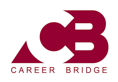
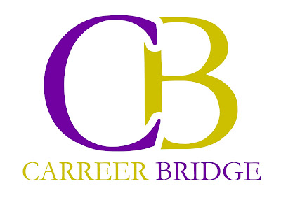
This assignment was to design a new logo for the Career Bridge at our school. This was mostly an assignment focusing on typography. We needed to make 2 different logos. One is colored close to the school color and the other is yellow and purple.

The first logo I made used the font called 'Crazy Loop in Paris' from dafont.com. I made the 'C' white and the 'B' burgundy. Then I made a shape behind the letters which was the same color as the 'B' so the 'C' would show up. Then I made the words 'Career Bridge' underneath the logo in the font called 'Arial'. I aligned the text to the logo by putting extra spaces inbetween the letters.


The second logo used the font called 'Garamond'. I made the 'C' purple and the 'B' yellow. I put a white 51 point stroke on the C and moved it so it overlapped the 'B' so there was negative space around the 'C'. Then I spelled out 'Career Bridge' underneath the Logo and made the word 'Career' yellow and the word 'Bridge' purple.


Thursday, February 25, 2010

School Play Poster


The latest assignment was to design the poster for the school play. It's called Suds and it's about the staff of a Car Wash. I found a Picture of a Volkswagen Beetle and put it into a 11x17 document in photoshop with a blue background. I went to Image - Adjustments - Gradient Map and made the gradient go from blue to whit with hardly any transition between the two colors. Then I found a picture of a hand print and overlayed the same blue as in the background. (A part in the play is when the characters are on a television show competition where they have to keep their hand on a car, if they take it off the lose and are out. The winner wins the car. Thus, the hand prints on the car) I duplicated the hand prints and warped each one to make them look slightly different from one another. Then I used a font I downloaded from dafont.com called '28 Days Later'. I spelled out the word 'SUDS', and I made an assortments of various circles to signify bubbles behind the title. I made the word 'SUDS' have a stroke of the same blue as the background so it had more contrast. I added the rest of the text to fit in the pictures. Then I made sevral variants of the poster each with a different color. Blue, Green, Red, Orange, and Purple.


Wednesday, February 10, 2010

CD Cover


This assignment was a CD cover. I made up a band called 'Crooked Soul' because I couldn't decide on a band to do a cover for. I found the picture of the eye here. Then I found the picture of the hurricane here. I cut out the eyeball part and inserted the hurricane into the hole that was left in the eye socket. I then took a picture of the grime for an effect from here. I erased parts of that picture so the eye could show through, then I went to Image - Adjustments - Hue and Saturation, and changed the hue to a more blue color. Then I took that layer and made it's layer mode 'Overlay'. Then I made a new layer and used the paint bucket to fill the whole canvas with a blue color and set that layer to 'Overlay' as well. I downloaded the fonts from dafont.com. The words 'Crooked Soul' are the font called 'Base 02', and the words 'Eye of the Storm' are the font called 'Defused'. Then I put the text all together. I gave the text an inner shadow and set all text layers to 'Overlay'. Then I added a slight white shape behind 'Crooked Soul' to make it a little more legible.

The band 'Crooked Soul' doesn't actually exist. It's just a band name I made up a while ago and so I thought i'd use it now. It originally comes from lyrics of a song by the band Switchfoot. "We are crooked souls trying to stay up straight." 'Eye of the Storm' just sounded cool so I used it as the Album title. There's blue because of the picture of the hurricane had mostly blue so I made it all fit together. I like the worn out look so I made it look old, grungey, and beat up. It's supposed to be like a metal CD so that's why it looks grimy and gritty. As you may be able to tell I like to use the layer mode 'Overlay'.


Tuesday, February 9, 2010

New Banner

My first assignment in Graphic Design 30s was to make the banner graphic for my blog. 

The whole idea was to play with layer modes on photoshop. I took this picture of myself, added a picture of fire to the background from Google Image Search, and played around with things. I generally experiment a lot when it comes to layer modes.

I love the way fire looks and the way it makes things look evil or hardcore, so i used it for the background. I also love grungey, messy text like the font I used. It doesn't signify me all that much, just the fact that I love those aspects of it.

Monday, February 8, 2010

Test Post

This blog will be me showcasing my graphic art. I will post my projects that I do in Grade 11 Graphic Design.

This picture was an assignment I did last semester. It is a movie poster. I made the ship in Cinema 4D, then I put it into photoshop and added the planets as well as the text.